Hotline (028) 39435899
LANGUAGE
flag enflag vi
interlogistics logo
A journey of a thousand miles begins with a single step.
A journey of a thousand miles begins with a single step. The strong growth of businesses comes from arduous beginnings. Starting from the spirit of developing a strong Vietnamese logistics industry, InterLOG has determined its mission is to create optimal logistics solutions and provide high-quality services to meet the needs of domestic and foreign customers.
On August 22, 2005, with the mission of bringing Vietnam's trademark and logistics capacity to the world, InterLOG was established with the name abbreviated from International and Logistics. Accompanying the brand name is the symbol associated with 7 circles symbolizing the connection of a solid supply chain. It is the convergence of Logistics experienced experts in Vietnam, ready to catch the waves of widespread internationalization.
story
Little steps on the path of sustainable development
/images/about/brand/small-step-lg.jpg
With an initial scale of just over 20 members working together to develop logistics services internally and externally, in 2006, InterLOG was certified as one of the strongest national brands. 2008 is an important milestone affirming the strong progress of InterLOG when becoming one of the standard Customs Brokers certified by the General Department of Vietnam Customs.
/images/about/brand/small-step-sm.jpg
Successor as it be, the position is further affirmed. In 2011, InterLOG continued to receive new opportunities and challenges when becoming a member of the World Cargo Alliance (WCA) - expanding the partner system worldwide; officially became the exclusive agent of AWS in Vietnam - an enterprise specialized in Master Consolidation in Asia.
Brand coverage, network development
Not only reusing small steps to enhance a powerful brand, but InterLOG also continued to expand its network, developing branches in Hanoi in 2013 and Hai Phong in 2016. In 2018, InterLOG continuously expanded its investment and developed market share when selecting a strategic shareholder, Daiichi Freight System - Top 05 Japanese Logistics enterprises; a joint venture with Asian Worldwide Services Vietnam, Asean Cargo Gateway JSC, etc., turning the company into an enterprise providing a wide range of comprehensive logistics services and
Phủ rộng thương hiệu

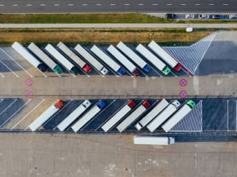
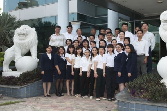
supply chain optimization solutions for large domestic and foreign enterprises. , especially enterprises in the FDI segment of industry and manufacturing industry.

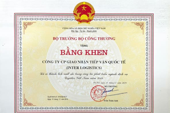
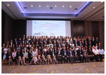
In 2019, with its achievements and positive contributions to Vietnam's logistics industry, InterLOG once again affirmed its brand when it was awarded the title of Enterprise with excellent achievements in industry development by the Ministry of Industry and Trade. Logistics services in Vietnam with an average growth rate of 20% annually.

phát triển mạng lưới
New brand identity
elevate the position
In 2021, entering a new phase, InterLOG changed its new brand's identity with new colors and symbols. This innovation of InterLOG aims at the stage of sustainable development associated with the E.S.G model and the development of comprehensive solutions for the logistics industry as well as the Global Supply Chain.
Entering a new phase
InterLOG aims to
Vision
Becoming a company providing integrated logistics solutions of international standards, aiming at the leading trusted supply chain solution architecture (4PL) in Vietnam.
Mission
Provide effective supply solutions that bring practical value to customers, organizations, and communities, contributing to improving quality and competitiveness in the global supply chain.
Meaning of
new brand’s identity
Image of the Eye
An image that always thinks about solutions to improve supply chain innovation towards the spirit of #InnovateforFuture
Image of Hands around the eyes
Showing the understanding and dedication of InterLOG people in all services and solutions brought to customers, partners, employees, members, and the community.
The hand-holding-eye symbol
The hand-holding-eye symbol means "thinking always goes hand in hand with action", showing InterLOG's human personality, which always thinks and implements solutions dedicated to its customers, partners, and employees.
/images/about/brand/logo.png
Tagline
"Supply Chain Innovator"
Means that InterLOG’s members always aim at the image of an architect creating improvements, innovating the appropriate supply chain inside and outside the business, and bringing to customers, partners, and the community the best quality and optimal services and solutions.
Logo versions
/images/about/brand/version-logo-one.jpg
/images/about/brand/version-logo-two.jpg
/images/about/brand/version-logo-three.jpg
/images/about/brand/version-logo-four.jpg
/images/about/brand/version-logo-five.png
Brand personality
/images/about/brand/card-brand-1.jpg
Customer insight
/images/about/brand/card-brand-2.jpg
Innovation
/images/about/brand/card-brand-3.jpg
Professional
Brand color system
/images/about/brand/color-one.jpg
Yellow-orange color
Symbolizing passion, creativity, success, and happiness; It is also a symbol of strength and endurance. This is also the color of fun, openness, and vitality like the brand's personality of InterLOG.
/images/about/brand/color-two.jpg
Black-gray color
The color of steel symbolizes the strong will to overcome difficulties like the spirit of 'How the steel was tempered'.
Complementary textures
Secondary textures express the personality and story of the brand more clearly, helping customers easily locate and identify InterLOG's brand identity.
/images/about/brand/support-textures.png
Texture meaning
Developed from the brand logo with the circle and eye symbol of the solution, the alternative to form the letter S of Solution, meaning a universe of ideas and solutions.
The circle means integrity, the best thing is that 2 parallel orange-yellow lines mean unlimited, and combining 2 circle hugs means providing quick and innovative solutions.
New branded publications
/images/animals/master.jpg
INNO mascot
With the circle means the solution in the eye of the InterLogistics logo as the main theme, InterLogistics' mascot is represented by an image with a round face and a unified eye.
The InterLOG mascot named INNO is an abbreviation of the word INNOVATION, which means always aiming for innovation. INNO wears yellow or orange as the main colors of the brand.
inno
inno
inno
inno
inno
inno
inno
inno
inno
inno
inno
inno
inno
inno
inno
inno
inno
inno
inno
inno
inno
inno
inno
inno
inno
Office branding system
/images/about/brand/name-card.png
/images/about/brand/name-card-2.png
/images/about/brand/profile-one.png
/images/about/brand/profile-two.png
Uniforms and other publications
/images/about/brand/outfit-one.png
/images/about/brand/outfit-two.png
/images/about/brand/outfit-three.png
/images/about/brand/outfit-four.png